Disclaimer

Black Dragon is MY Viewer, i decide which feature i want to add and which to remove, i share this Viewer to show the world that user base size is not important, i do rate quality by effort, thought and love put into the project, not some rough estimated numbers. I consider feature requests only if i you can name proper valid reasons i can agree on. It is my (unpaid) time i'm putting into this project, i'm not here to cater to every Joe's desires.

Monday, November 7, 2011

Cleaning up the UI

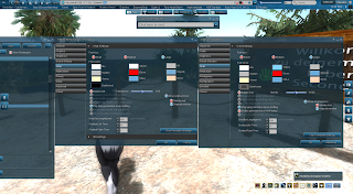
man...the UI is a MESS especially Preferences ..., im handchecking every Preferences panel right now , reordering them , realigning them and overall giving them a more constant look , instead of thousands of button heights , checkbox heights , text lengths , chaos alignment, different spaces between each button etc...

the worst were the Graphics panel and Chat which both had those Accordions hidden until you click on the first one , which MUST be changed , so i realigned those whole panels and even could make the preferences panel 8 pixel thiner and 10 pixel shorter , how´s that possible you may ask? magic? no , if every button is 7 pixel away from the above one you can save 2 pixel per button when reducing it to 5 which looks better anyway now we got 10 buttons x 2 pixel makes space for 20 pixel which is equiv 1 new button

left Panel is the new one , right panel is the old original one


No comments:

Post a Comment